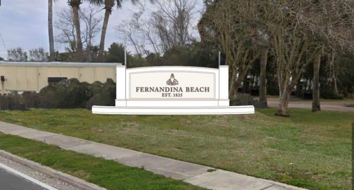
Call it what you will — a welcome sign, a gateway to the city — but the sign at 8th and Lime streets greeting people as they enter Fernandina Beach is the latest line in the sand among local leaders who are trying to limit change from the current atmosphere on Amelia Island.
The sign is under the purview of Fernandina Beach Main Street, and changes are coming. The site also includes landscaping needs, with respect to the tree canopy and lighting. Lisa Finkelstein of Fernandina Beach Main Street went to the Fernandina Beach City Commission this week seeking ideas and consensus on what the design should be of one of the two sides of the gateway.
A suggestion for the southbound side of the road is a set of flags, while the northbound side of 8th Street has the sign itself.
“It became more of an emergency recently because of the condition of the sign,” Finkelstein said. “Finally, in the last hurricane, the right side of the sign was removed — torn off — so both sides were removed, leaving us with the center section. It’s become more of an urgent situation that we refurbish it or do something with it, because it is currently an eyesore.”
That sign originally went up in the 1980s, when sleepy Florida fishing villages like Fernandina Beach became the hot spots for coastal land development and tourism.
Former Mayor Mike Lednovich fired back at the plans to change the sign in October.
“We received an email that the county had approved hiring a party to design our sign,” Lednovich said. “And, my first thought was, ‘Who asked you? It’s our sign.’ So, this is more of the county trying to make the whole place look the same. Is that what we want? It’s not what I want.”
Money for the effort is coming from a Nassau County fund, based on a 2021 for branding the Amelia Island gateways. This sign was part of that problem, and the county is working with Main Street to release money for the new sign design.
“Overall, the direction we received from the City Commission was that the sign be clean and simple, that it be a textured, solid surface … that there be no lattice,” Finkelstein said.
Jeff Dawson, the designer brought on to the project, said it’s moved away from the first ideas that were part of the county’s tourism and beach harmonization project.
“We varied a little bit from the approach we were taking there to develop a couple concepts,” Dawson said.
One plan, a simple design, immediately drew jeers through online discussions.
“The majority of those who look at the proposed City entrance sign think it looks like a tombstone,” local resident and group administrator Mac Morriss wrote in a message for Commissioners. “My guess is about 95% don’t like it for several reasons: looks like a tombstone, boring, costs too much, not unique and looks like an everywhere else sign. They like the old signage with nonprofit symbols.
“This is the gateway to the City of Fernandina Beach. It represents this community. The old signage declared that we were a strong community with local volunteer group involvement. The old signage declared we had a history and culture uniquely ours. The new signage looks like boring death. You can do better.”
Reception among Commissioners was a little better. Commissioner Darron Ayscue said he liked the new design, but preferred the older sign and asked about possible repair costs. Commissioner Chip Ross remarked on the new design’s simplicity and elegance.
“I like the design with the columns on each side,” Vice Mayor David Sturges said. “It looks very attractive the way that is, the way it’s designed. Personally, it looks really nice.”
Commissioners generally agreed Main Street is on the right path for the redesign, with the work set to continue through the coming weeks.


One comment
RayRay21
January 6, 2023 at 8:20 pm
I like the old sign too. But what do I know, as a native(born and raised) remember when they put it up.
Comments are closed.